AXUREBOUTIQUE
Libraries
Introduction
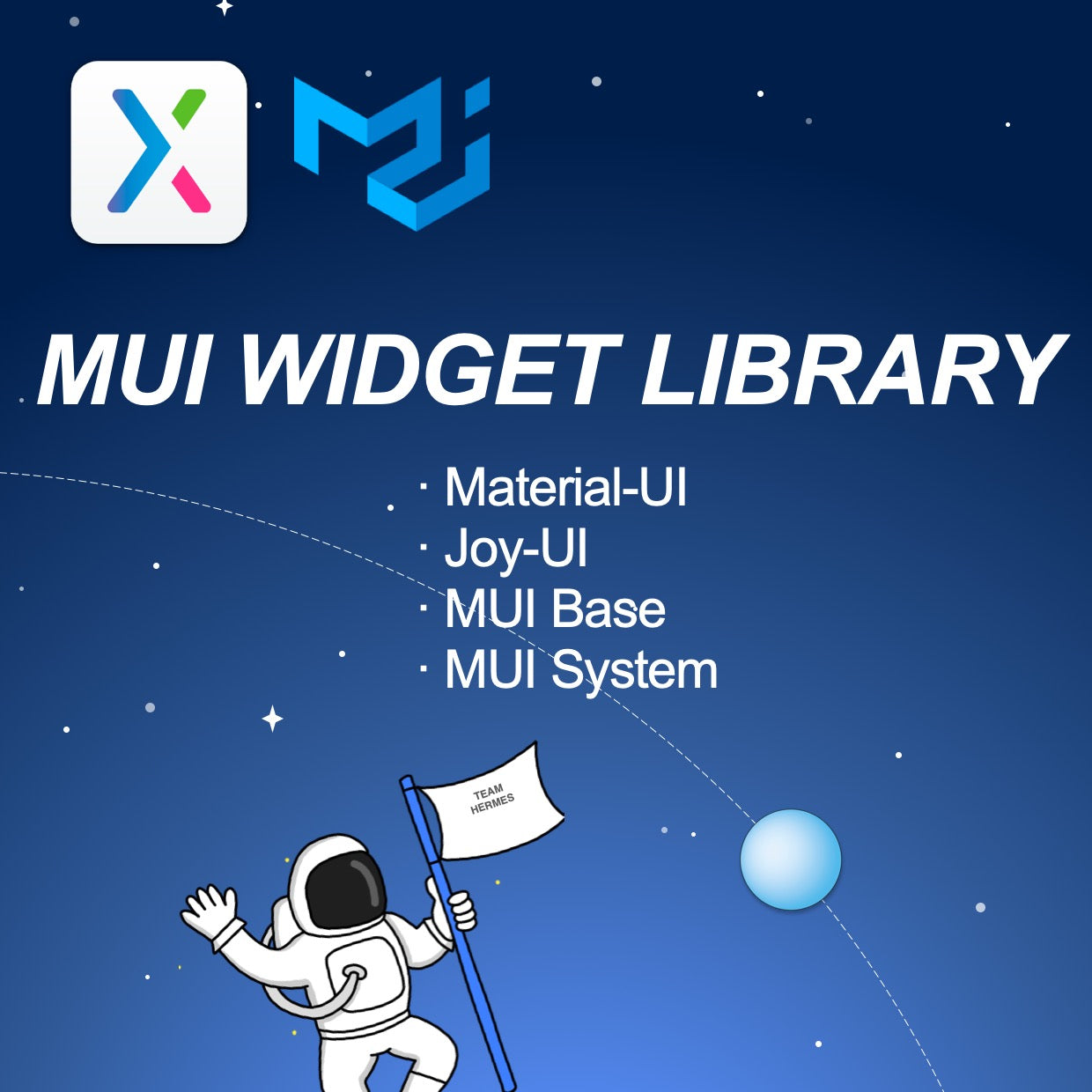
MUI offers a comprehensive suite of UI components to help you design new features faster. It is suitable for mobile and desktop web/application design.
This widget library includes 3 parts:
· Material-UI for faster and easier web & mobile development. Build your own design system, or start with Material Design. This work is designed strictly according to the Material-UI official website.
· Joy-UI is a library of beautifully designed React UI components.
· MUI Base is a library of blank ("unstyled") React UI components and low-level hooks.
· MUI system lets you quickly build custom UI components leveraging the values defined in your theme.
Features
· Pixel perfect
· Interactive and motional
· Most MUI components Included
· Supports fast Searching
· A large number of widgets
Material-UI
· ToolPad Core
Sign in Page, Dashboard Layout
MUI-X
Tree View
Material-UI
· Data Display
Lists, Tooltip, Typography
Joy-UI
· Inputs
Autocomplete, Toggle Button group, Skeleton, Accordion, Drawer
MUI Base
· Inputs
Autocomplete, Number Input,
· Feedback
Snackbar
Joy-UI
· Inputs
Button group, Input, Text area
Joy-UI
· Feedback
Modal
Joy-UI
· Feedback
Alert
Joy-UI
· Data Display
Aspect ratio, Avatar, Badge, Chip, List, Typography
· Surface
Card, Sheet
· Navigation
Breadcrumbs, Link, Menu, Tabs
Joy-UI (New!)
· Inputs
Button, Text field, Checkbox, Radio button, Select, Slider, Switch
MUI-Base(New!)
· Inputs
Badge, Button, Input, Select, Slider, Switch
· Navigation
Menu, Table pagination, Tabs
· Utls
Click-away listener, Form control, Modal, No SSR, Popper, Portal
MUI-System(New!)
· System
Basic, Border, Display, Flexbox, Grid, Palette, Positions, Shadows, Sizing, Spacing, Typography, Advanced, Styled
· Components
Box
Material-UI
· Layout
Grid, Grid List
· Inputs
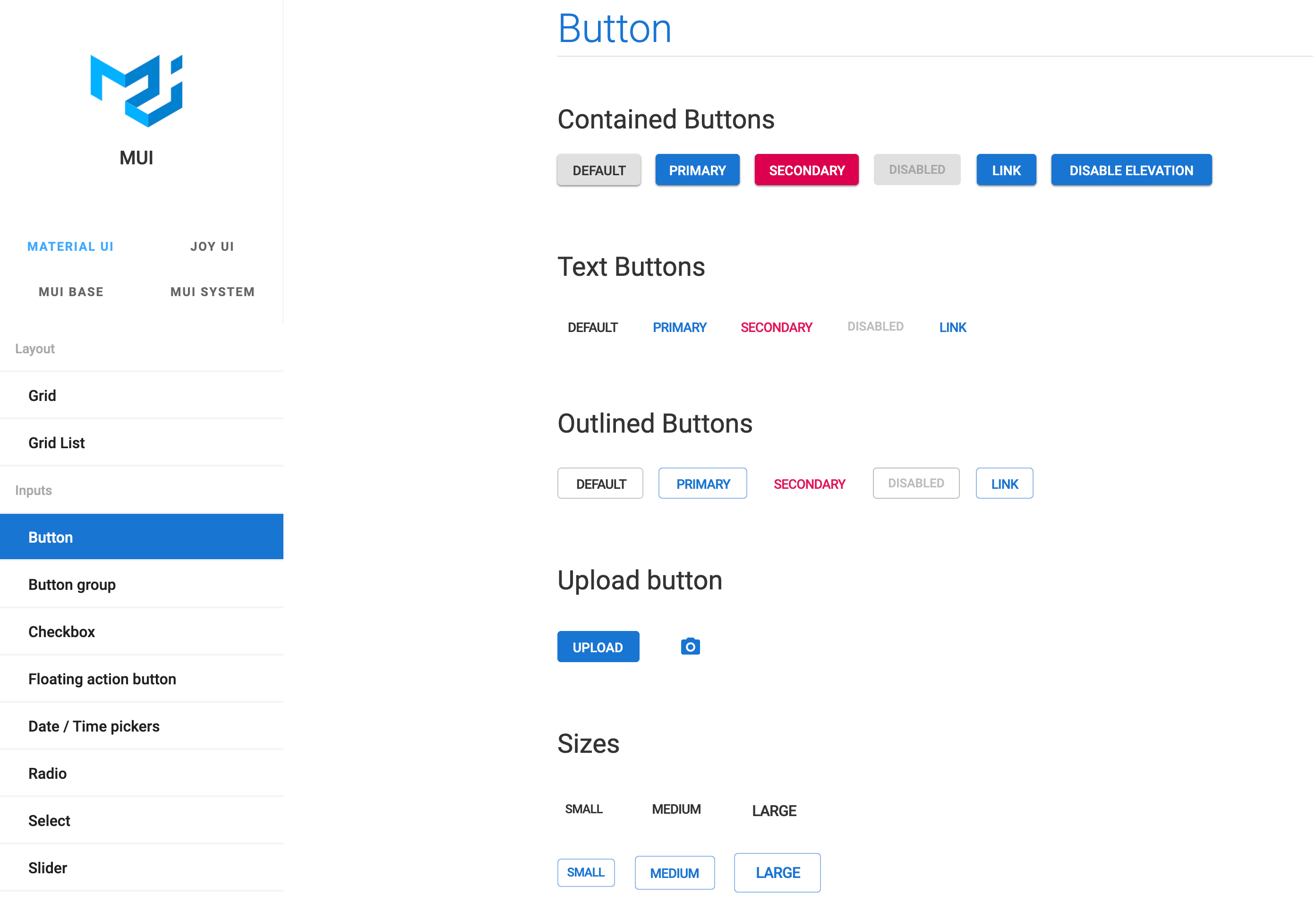
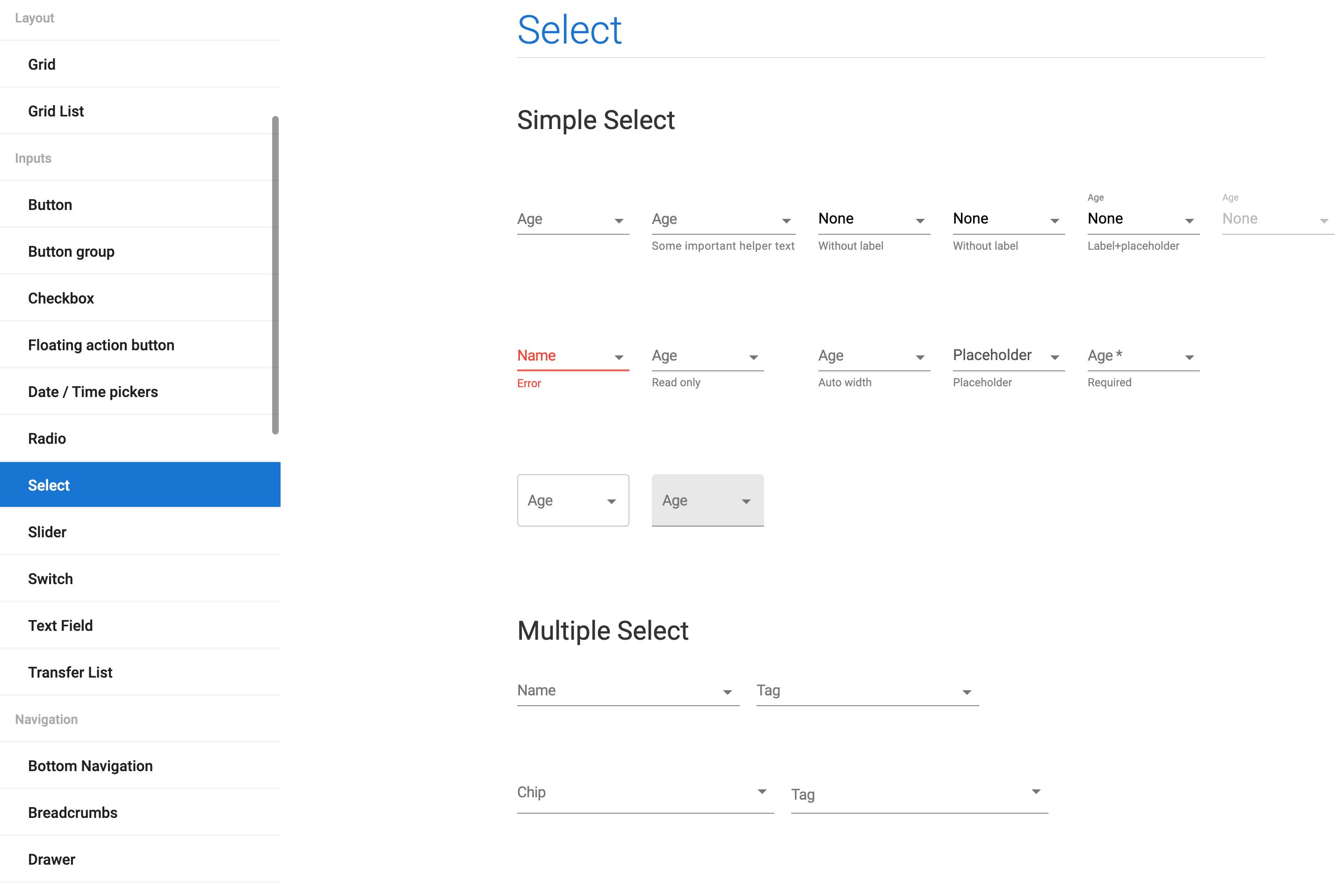
Button, Button group, Checkbox, Floating action button, Date / Time pickers, Radio, Select, Slider, Switch, Text Field, Transfer List
· Navigation
Bottom Navigation, Breadcrumbs, Drawer, Links, Menus, Stepper, Tabs
· Surface
App Bar, Paper, Card, Accordion
· Feedback
Progress, Dialog, Snackbar, Backdrop
· Data Display
Avatar, Badge, Chip, Divider, Lists, Table, Tooltip, Typography
· Utils
Popover
| Requirements |
Axure RP 9 or up |
| Application Field | Mobile & Desktop, Widget Library |
|
Download Includes |
· MUI demo (.rp) · MUI widget library (.rplib) |
| Pages | 279 |
| File Size |
67.1 MB |
| Updates |
Free for Life |
Support
Contact | Refund Policy | FAQ | How to Use Our Axure Library Products | How to Use Our Axure Template Products
Questions
After payment is confirmed, your download is available from the order confirmation page and in My Downloads. We also send access details to the email used at checkout.
Choose Individual for one user, Agency for a small team, or Enterprise for broad internal use. The purchase panel shows the price for each available license.
This product is delivered as a ZIP download. The files included are listed on this page and may vary by license.
No. You can check out as a guest. Creating an account lets you view orders and return to your downloads more easily.
Article
Learn practical ideas and methods from this arco design system axure widget library & templates article to improve product design, UX work, and Axure prototyping.

Article
Learn how widget libraries organize reusable elements and help teams create consistent prototypes faster.
Article
Learn practical ideas and methods from this axure rp 10 tutorial: how to use the widget library article to improve product design, UX work, and Axure prototyping.